The purpose of branding is to present a unified message about the company and its products. And also wrapped up in this is the need to deliver a story that customers can relate to, in order to establish better connections and loyalty with those people.
Businesses spend large amounts of money on branding because the impact of having a well-established brand is a very strong one when it comes to sales and repeat business.
Digital branding, as presented on a website, is a narrow aspect of the wider possibilities, as web pages are mostly viewed in 2D and on a relatively small display.
However, the difference between brands online and offline is more subtle than the technical limitations of screens. Whereas offline branding only appears where the company places it – i.e. on business cards, stationery, T-shirts and billboard posters – online branding can appear almost anywhere.
That hints at one of the issues with online branding, in that there is a possibility that control over the branding is much less refined, and there’s the danger that a brand could be hijacked by others.
- We’ve chosen the best web hosting services right here
Branding guides
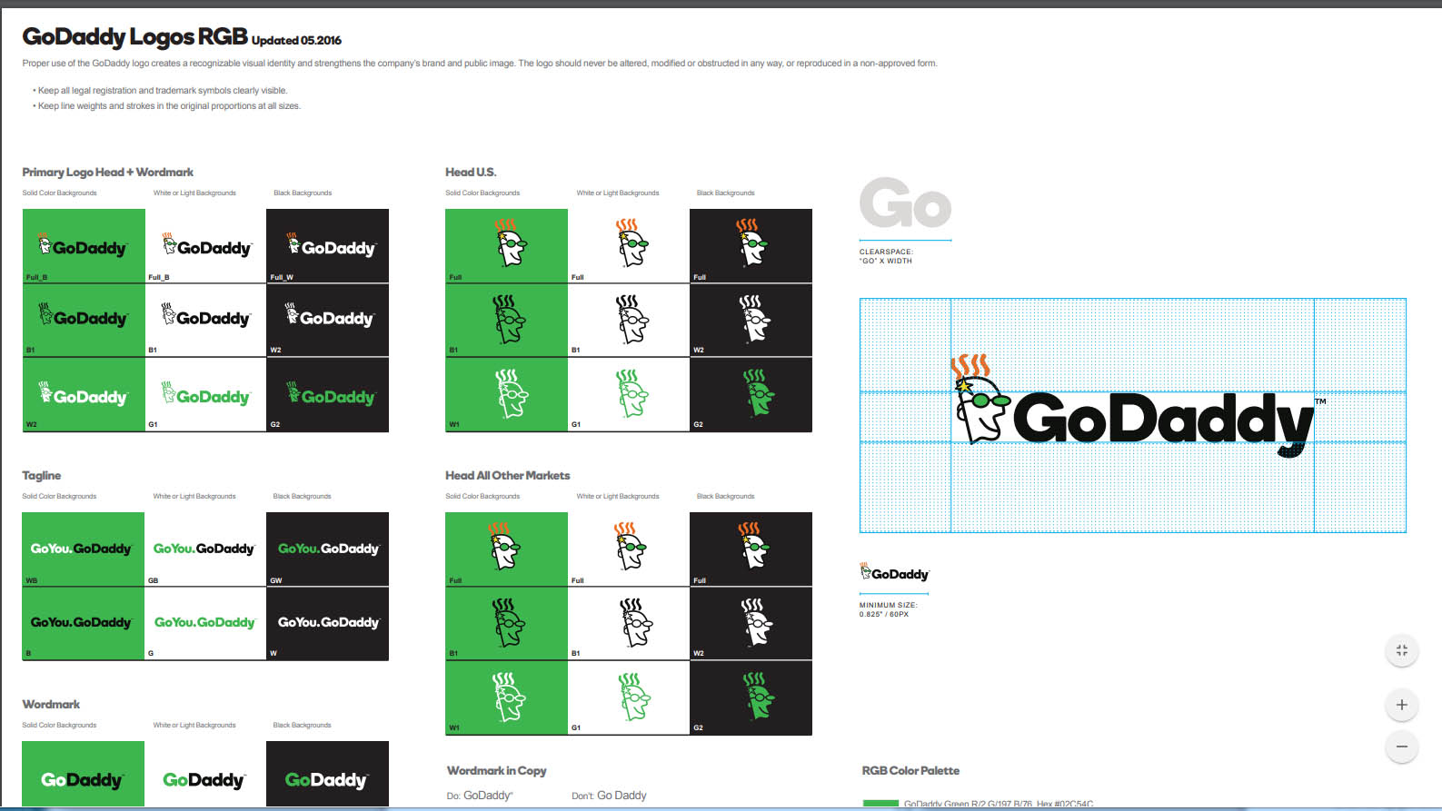
Most large companies have a branding guide that has been created by the marketing department and outlines how their brand should be represented.
This documentation was doubtless mostly created for print operations so that when they produce posters or promotional material, it looks like everything else that comes from the company.
The guide will detail the various forms of the company logo, how it is used on dark and light backgrounds, and what fonts and lettering are appropriate alongside it.
What isn’t usually covered is exactly how big or small a logo can be, and how large it should be in relationship to other elements of a design.
For web branding, the size of a logo is important because of the impact on screen space – and so are the colors that the logo uses.
Colors for web representation are approximations and not the Pantone accurate hues that printed materials utilize. All screens have different gamut (color space) scopes, and typically they are not color-calibrated to be perfect.
Therefore a branding guide for web use should have logos in set sizes, Hex defined colours (#000000 is black), preferred font names and font sizes.
Once this template has been created, and example files stored online for sharing, they can be provided to any web developers working on branded content to maintain a definitive styling.
Website branding tricks
Let’s take the time to consider 10 important tricks to website branding that you might well benefit from.
1. Logo size
We’ve already mentioned the presentation of the company logo. This is a key issue, and it’s important to decide on the size of the logo and then stick with that scale wherever it is used. Having different sizes of any branding is confusing, and means you can’t reuse the same graphics.
2. Cross-branding
If your site contains other branding, such as sell-through products or businesses that are partners, then make their logos less prominent.
Making other company logos the same size or bigger than yours sends entirely the wrong message about your brand’s importance.
3. Limiting files
If you can keep all branding elements to a very small number of files, and reuse these throughout the site, this will give you many advantages. Not only will this make the site quicker to load for visitors, but when a rebranding occurs, it will be much easier to change everything.
4. Use PNG for logos
The preferred file format for websites is JPG. However, this format doesn’t support transparency, and the PNG format does. If the logo is a PNG file it can be placed over backgrounds without having to make a special graphically integrated version.
5. Have a proposition
A new visitor wants to know if they’ve arrived at the right site, and also understand what they can expect to find there. Tell them who you are, what you do, and what makes the company or person special.
6. Be consistent
Using the same logo and colors is good, but this consistency should extend to every aspect of the site, including the personality behind the wording and the placement of commonly utilized elements.
Considering a retail equivalent, all signs and carpets should be the same, and promote a clear and concise theme and style.
7. Consider a mascot
A mascot doesn’t work in all contexts, but having a mascot animal, robot or character is a strong idea that visitors will recognize even without the company name. But be warned, not all mascots are loved. Just ask Microsoft’s Clippy!
8. Consider social media
If you intend to use your brand on social media – and most will – then consider the restrictions that this places on graphics, and work with them. Perhaps designing specific logos for social media is a good idea, as you can tweak them to work best in that context.
9. Think about visual scanning
When a person reads a website their eyes perform a pattern of movement that starts at the top-left, then moving right and down. That’s why the logo should be in the top-left. Consider where a visitor’s attention will linger, and place branded elements and business messages in those locations.
10. Watermarks and tints
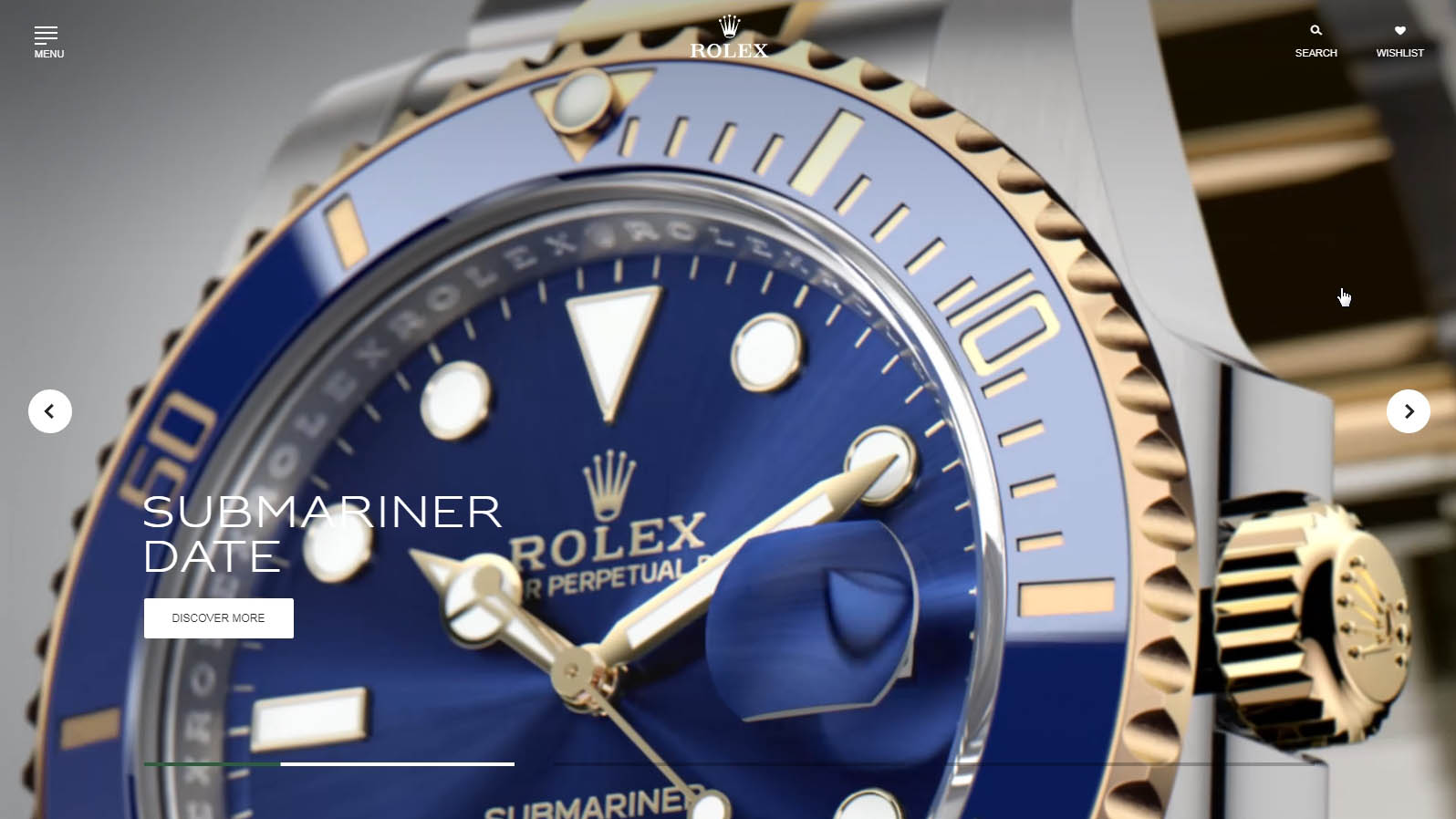
If you have an elaborate logo, placing it over a detailed image won’t work well visually. There are two approaches you can take to resolve this problem.
One is to make the logo a watermark on the graphic, either lightening or darkening the content underneath and removing all the colors from the logo. Or conversely, make the background image monochrome, so that the logo stands out over it. Either approach will work.
from TechRadar - Internet news https://ift.tt/2P1QdLe
via IFTTT


0 comments:
Post a Comment